
Natera’s website redesign
I worked on an overhaul of Natera’s website, which transformed our brand from out-of-date and inconsistent to contemporary and unified look and feel. My responsibilities included contributing to the UX research, creating the wireframes, mockups, and prototypes; creating new graphics as well as redesigning the graphic assets including the charts, graphs, and infographics; creating a new consistent set of icons; and working with the dev team to implement the prototype, perform QA, and conduct testings. This strengthened Natera’s brand trustworthiness and reflected our core values of using advanced technology to improve people’s health. The engagement rate increased by ~54% and conversion rate by 23%+ in the first 6 months of the launch in 2021. The new visitors increased up to 200% to date.
DATE
June 2020 -
June 2021
MY ROLE
Lead visual designer
TEAM
VP of Marketing
Director of Brand and Creative
Web Developers
Digital marketing team
Product marketing managers
Design agency
DELIVERABLES
Website, Style guide, Icons/patterns/charts/infographics, Landing page templates


Examples of Icon sets, Infographics, and Graphs that I created for the new website and other materials
Natera website BEFORE redesigning

MEET THE USERS

Wireframes
PREPARING USER JOURNEY
We constructed a user flow of what a basic start to finish journey of the persona looks like while browsing the information about Natera’s products. This helps us in understanding ways users can interact with the website, as well as allowing us to see the opportunities to improve.

Persona 1 - Physician: Amy’s User Journey on looking for the information about genetic testings for Women’s Health that Natera offers

Persona 2 - Patient: Rachel’s User Journey on looking for the information about genetic testings for Women’s Health that Natera offers
AGGREGATING FEEDBACK
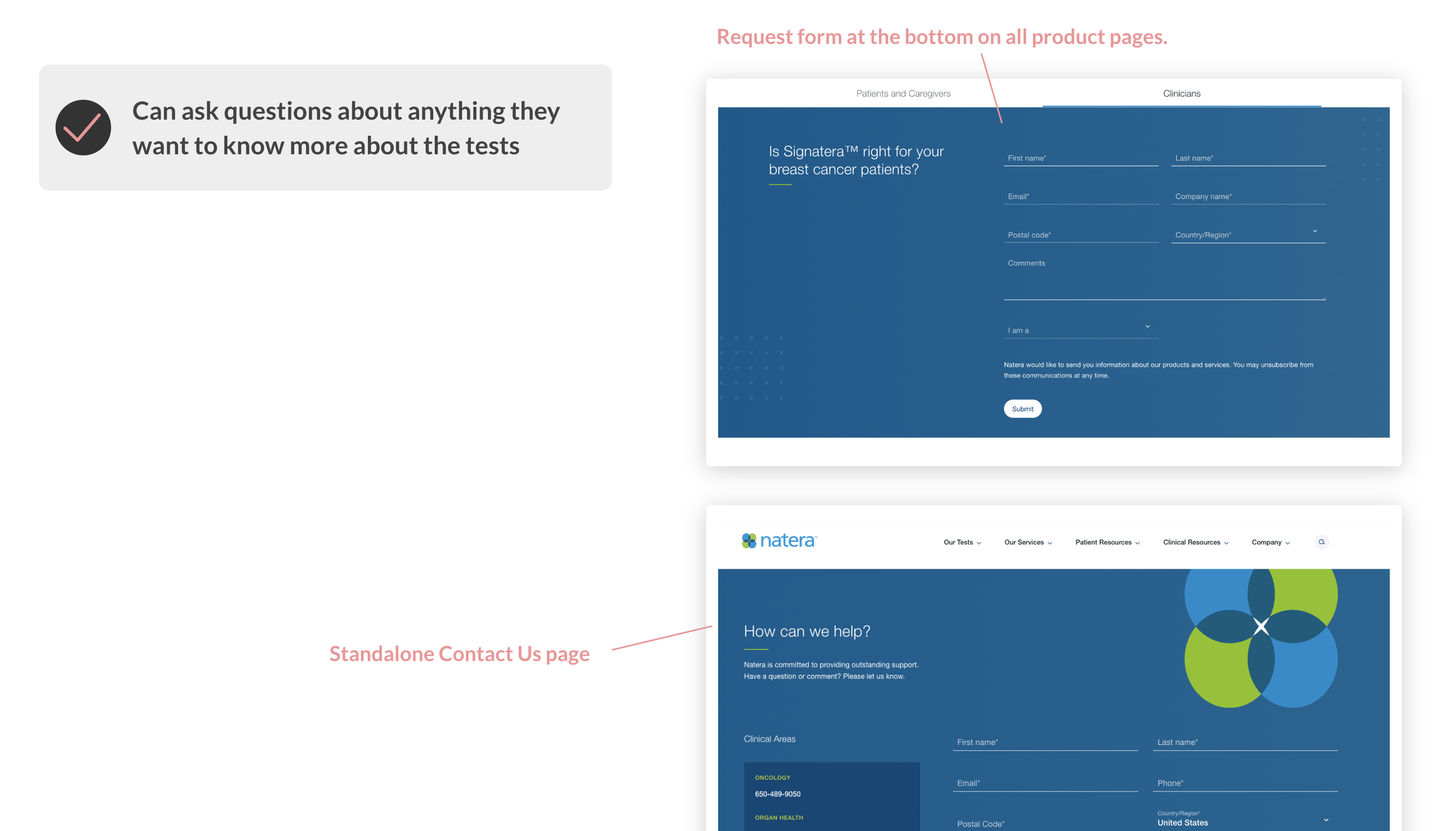
We used an affinity diagram to categorize the data into groups of similarities. There were 5 groups of feedback that were most common among all participants including: Navigation, Product information detailed page, Resources, Search and Form features, and Brand look and feel. We used the information from the diagram to work on the improvements of the website UX/UI.

BUILDING WIREFRAMES
After sketching out some paper wireframes options and thinking through the preliminary flow, we reviewed what was necessary, unnecessary, and what areas needed improvement. We invested a lot of time into this step to make sure we had the finishing touches on the underlying UX before moving onto the visuals.


Usability Testing
OVERVIEW
Research goals: Determine if users can easily find the information that they need on the website.
At the end of the usability testing, we aimed to answer the following questions:
What can we learn from the user flow, or the steps that users take, to learn about a specific Natera’s product?
Do users find the navigation that differentiates between Patients and Providers helpful?
Do users think the educational resources helpful?
Are there parts of the user flow where users get stuck?
Are there more information that users would like to see?
Do users think the website is easy or difficult to use?
The study was done remotely in the United States and was moderated. Each session lasted 30 minutes.
Participants are physicians, genetic counselors, and patients in the US. Four males, five females. One participant of assistive technologies.


TESTING RESULTS
After completing the usability testings with 9 participants about the new design solutions for the website, we revisited 5 groups of feedback from the affinity diagram we synthesized earlier in the process about the old website. We conducted a survey to confirm if the new design had solved the problems and met the users needs. Below were the survey results:

CONCLUDED RECOMMENDATIONS FROM THE USABILITY TESTINGS
The new design has significant improvements compared to the old one: the functionalities are intuitive and simple for users to use and look for what they need (~96% agreed); the brand look and feel are modern and trustworthy (100% agreed)
Some areas can be improved:
Homepage information is not clear about who Natera is
The main navigation menu hover feedback is not clear enough to know what directory users are at.
The mini menu on the product page is redundant
Need more testimonials from real life stories from physicians and patients who used Natera’s products
Need more comprehensive educational resources (publications, case studies, white papers, webinars)
Some content contains too much technical jargon for users (patients) to understand
200%+
new website visitors since launch in January 2021
54%+
engagement rate
96%
brand awareness and trustworthiness
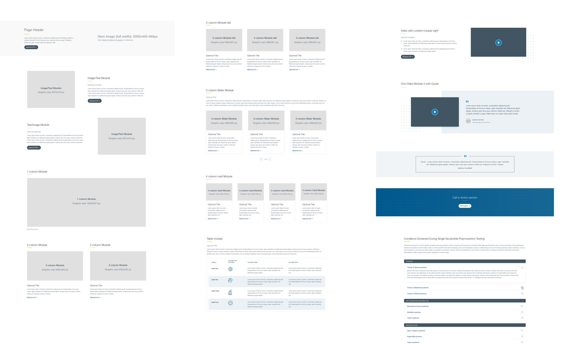
STANDARDIZE THE PROCESS
In order to streamline the process of creating all the web pages and maintain consistency, I created standardized web templates with Figma components. These templates are also being used for campaign landing pages.
ACCESSIBITILY CONSIDERATIONS
Provided access to users who are vision impaired through adding alt text to images/graphs/infographics for screen readers.
Used clear and illustrative icons combined with text to help make navigation easier.
Applied the appropriate contrast ratios to text and background colors for legibility.
NEXT STEPS
We continue to improve the UX/UI of the website via testings and aligning with business needs.
Final Designs
Some “Before and After” of the redesigned pages
Natera Home Page

Natera Oncology Patients page

Natera Organ Health Overview page

Natera Women’s Health Horizon Clinician page

Mobile responsive

Video walkthrough on the live website
Standardized templates
In order to attract traffic to our website and landing pages, I also created the standardized and customized email and social templates for all three business units (Women’s Health, Oncology, and Organ Health); and the social ad sets for promoting some of Natera’s large campaigns.

